Increasing Enrollment Leads by 600% through Site Redesign for Childcare Company

Sana Ali

Blooming Bud Daycare Center is a local Chicago business that's been providing child care services for 30 years. In 2020, I was brought on as a design specialist to lead several design and operational projects, including a complete website redesign and rebranding initiative.

I worked on the website redesign project from October 2020 - February 2021 as the sole designer in charge of user research, sitemapping, iconography, UI design, copywriting, & SEO strategy. I built the site in Wix and used Adobe Illustrator & the Google Business Profile Tools.

Main idea

problem

The Blooming Bud website had not been updated since 2010.

The site needed a complete overhaul to better serve the needs of its users and compete with the marketing strategy of other local daycares. The website needed:

  1. more relevant information & content that informs users on programs & offerings
  2. updated page layouts and responsive design to work across devices
  3. restructured, organized information architecture
  4. engaging visuals and animations cohesive with concurring rebranding project
  5. a competitive SEO strategy

opportunity

Create an engaging and helpful website for the Blooming Bud user base that accounts for the business strategy of key stakeholders.

Solution

A redesign with relevant content for parents, friendly visuals, & refreshed information architecture.

The site redesign allows parents to efficiently find the site, navigate around, and assess the service offerings & care culture. Within 6 months of launch, business stakeholders successfully met marketing goals for customer & staffing lead growth and brand identity consistency.

Relevant & Helpful Content

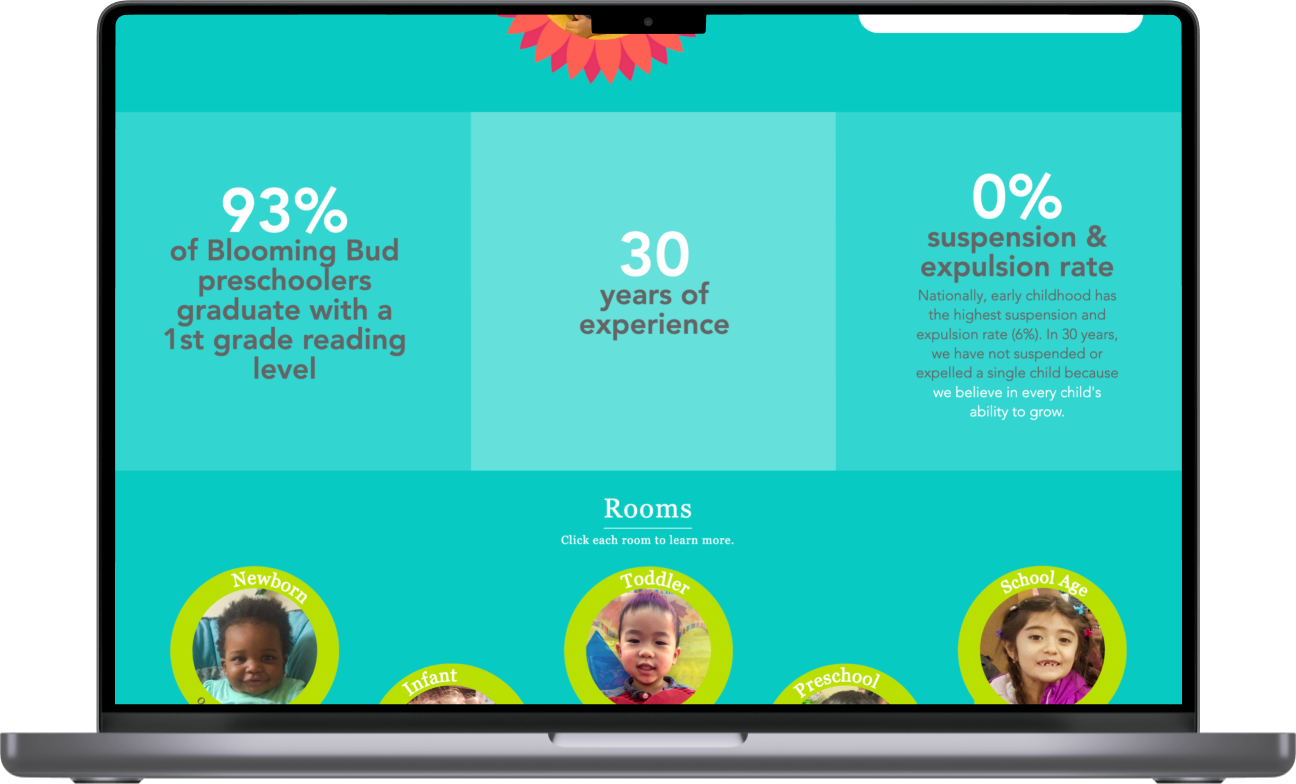
Parent-Friendly Copy

Daycare home page mockup. Displaying reassuring business data for parents.

Engaging Visuals

Blooming Bud Home page

design Process

STAKEHOLDER INTERVIEWS

I conducted an extensive informational interview with the owner and several key stakeholders to better understand the user base and current concerns with the website. We also discussed marketing strategies related to branding and market positioning.

COMPETITIVE ANALYSIS

I ran a competitive analysis on 6 other daycare businesses, 4 were direct competitors, located in the target neighborhoods, and 2 were indirect competitors. This analysis compiled information on site designs, features, visuals, SEO rankings & descriptions, and traffic analytics.

USER INTERVIEWS

I conducted user-base interviews to get a better understanding of user needs and expectations. I selected 3 participants within the target audience — parents/expecting parents of children age 12 and below, living in the target location — and asked about their opinions on the existing website and what they look for when seeking child care.

After conducting the research above, I synthesized all the information into the following key insights needed to define the website needs for users and stakeholders:

The site user base consisted of multiple groups & use cases.

Parents who are:

  1. current clients
  2. looking for daycare service (children ages 0-5)
  3. looking for after school/before school services (children age 5-12)

Teachers & potential staff looking for career opportunities

Parents expect quality daycares to have a strong online presence, good reviews, parent testimonials, and extensive information on available offerings.

Competitors with the best KPIs (traffic & SEO rankings) had cohesive brand identity & visuals, engaging copy, and animations on their site.

Sitemap

The design began with rethinking the information architecture and creating new content to address the lack of information on the old site. Changes to the sitemap included:

  1. creating individual pages for every daycare room to allow for in-depth information
  2. adding an enrollment flow
  3. including a parent resources blog to increase parent engagement
  4. adding a separate careers page for prospective staff

SKETCHES, PAPER WIREFRAMES & WIX

To quickly iterate through design options, I sketched out page layouts and refined the best elements into paper wireframes. Chosen elements included:

  1. parent testimonials carousel
  2. information tiles/bubbles to break down heavy content in visually appealing way
  3. highlights gallery and microcopy to convey care culture

I referenced the sketched wireframes when I began building the site directly on Wix.

COPYWRITING

I developed much of the copy myself and collaborated with stakeholders on information-heavy content to ensure accuracy. I aimed for succinct and accessible writing. Copy-heavy sections were divided into readable segments and paired with appealing visual layouts.

SEO management, meta description settings for website

Meta Description Settings

SEO strategy

To ensure the business goals of the stakeholders are being met, I also developed and executed an SEO strategy to improve rankings and customer leads. This strategy included.

  1. organizing information architecture by keywords
  2. developing effective meta descriptions
  3. creating a parent resources blog for increased engagement & backlinking
  4. compressing site images for faster site loading and geotagging them to the daycare location
  5. utilizing google business profile tools to introduce additional channels for targeted local engagement

ACcessibility

The following considerations were taken to increase accessibility:

1

Developed simple & effective copy to reach users of ranging reading skills & english proficiencies

2

Organized pages by recognizable landmarks to aid assistive technologies

3

Tested with color contrast tools to ensure readability under colorblind visibilities

UI Design

At the same time of the site redesign project, I was also working on a rebranding initiative, in which I designed a new logo and worked on branding. As a result, developing the the UI elements for the website was straightforward. All the UI elements — color schemes, typography, iconography, logo, and animations — reflected the bright, friendly visuals and brand identity that were being crafted concurrently.

UI Elements

Visual Components & Iconography

IMPACT

Within 6 months of the redesign launch:

direct site traffic
increased by

450%

indirect site traffic
increased by

800%

enrollment leads
increased by

600%

Traffic data increase after site launch, data from Nov 2020 - August 2021

"My business was saved during the pandemic in part due to Sana’s amazing work with the website. Her attention to detail and communication is why she stands out more than other web designers I’ve worked with."

- Blooming Bud Owner

What did i learn?

  1. Wix. This was my first time working in Wix, which is very similar to other "drag and drop" website builders I've used. It's a pretty intuitive tool, although there are limitations in it's customization that I had to problem-solve around.
  2. Design is a nonlinear, iterative process. I went through several rounds of informal testing and scheduled feedback sessions to improve the designs. Although repetitive, each round of refinement got me closer to the site launch with a better product. I also found myself going back and forth between the various design stages, showing me that the process is not as linear in practice.

Scroll to