Improving Buyer's Confidence by Designing Album Listening Flow for Phoebe Bridgers' Website

Sana Ali

Home page hifi mobile mockupMusic collection page hifi mobile mockupPurchase confirmation page hifi mobile mockup

Improving Buyer's Confidence by Designing Album Listening Flow for Phoebe Bridgers' Website

Sana Ali

Home page hifi mobile mockupMusic collection page hifi mobile mockupPurchase confirmation page hifi mobile mockup

This is a case study on a solo project completed for the Google UX Design Certification Course over 9 weeks (Nov - Jan 2022). I primarily worked in Adobe XD. The project brief was to “improve a website for a musical artist in Los Angeles,” so I used the website of musical artist Phoebe Bridgers for this study.

I followed the user-centered design framework to develop the redesign concept. I was responsible for user research, sitemapping, sketching, wireframing, low & high fidelity design, prototyping, usability testing, and UI design.

Main idea

problem

Users often have low buyer's confidence for web store purchases related to new music.

The website doesn't meet user expectations for fans that want to listen to new music releases before finalizing any purchasing decisions on vinyl, cds, and merchandise.

opportunity

How might we better inform & excite fans visiting the site?

Solution

An album listening flow to accompany the browsing experience, giving fans direct access to Phoebe's music

I designed the website around having easy access to listen to Phoebe's music, which is the primary reason fans feel connected to Phoebe and want to visit the site.

Home & Browsing

Informed Browsing

By designing the site around the music listening flow and promoting streaming links, fans are better informed, engaged, and excited while browsing, leading to more confidence on music & merch purchases.

The information architecture of the store pages have been reorganized by "album eras," centered around primary research on what feels most intuitive to fans.

Better Fan Experience = Increased Sales

The redesign directly promotes streaming, vinyl, cd, and digital album sales and indirectly promotes tour, merch, & related sales.

Add to Cart

Checkout

Branded Visuals to Excite Fans

The new site offers an intimate fan experience from homepage to checkout with cohesive visuals from Phoebe's artistic & brand identity. Users can experience the site across multiple devices with better responsiveness.

design Process

user interviews

I conducted  interviews in order to get a better understanding of the user needs and problem. I selected 5 participants within the target audience — music fans who have frequented online merchandise stores — and asked them their opinions on the Phoebe Bridgers website, purchasing habits, and frustrations with their typical browsing + purchasing experiences. I synthesized over 90 data points into the following key insights:

Users want to listen to the music before deciding on any vinyl/cd/digital purchases, even if they are already fans.

"I’m only going to buy a vinyl if I’ve listened to the entire album and already know  I love it"

Interview Participant #5

Fans enjoy websites that reflect the artist’s personality & existing brand identity.

"the checkout feels like a different website, it would be cool to see some of the same personality throughout the website."

Interview Participant #3

Users need a quick & easy checkout process.

"[Merch drops] can be stressful because I’m rushing to get it before it runs out of stock."

Interview Participant #5

Users often have had trouble with browsing + purchasing on mobile sites.

"[band]'s website doesn't work on my phone. It takes forever to load and the pictures don't show up right."

Interview Participant #2

Personas & problem statements

Based on the interviews & fanbase research, I created 2 personas for different use cases and referred to these throughout the development process. The first use case is for a user coming to the site to keep up with new music releases & touring information. The second use case is for a user interested in buying merchandise like vinyl and apparel. I then wrote problem statements to define the user needs of the personas.

Persona 1, use case for finding music & touring infoPersona 2, use case for buying merchandiseProblem Statement: Selena Ramati is an avid Phoebe Bridgers fan, & social media user, who needs to be notified when new music is released and given easy access to streaming platforms because she enjoys the listening experience and wants to determine quickly if the music is worth purchasing on vinyl before it runs out of stock.

User Journey map

I mapped out the users’ steps to see how I could simplify the process of reaching their browsing & purchasing goals.

User Journey Map

sitemap

User pain points included:

  1. difficulty in locating where to listen to the artist music
  2. difficulty locating what mediums (vinyl/cds/digital) were available for purchase

Keeping this in mind, the designs needed to include this information front-and-center on the homepage and every related subpage (Music Page & Individual Album Pages).

Sitemap

SKETCHES & PAPER WIREFRAMES

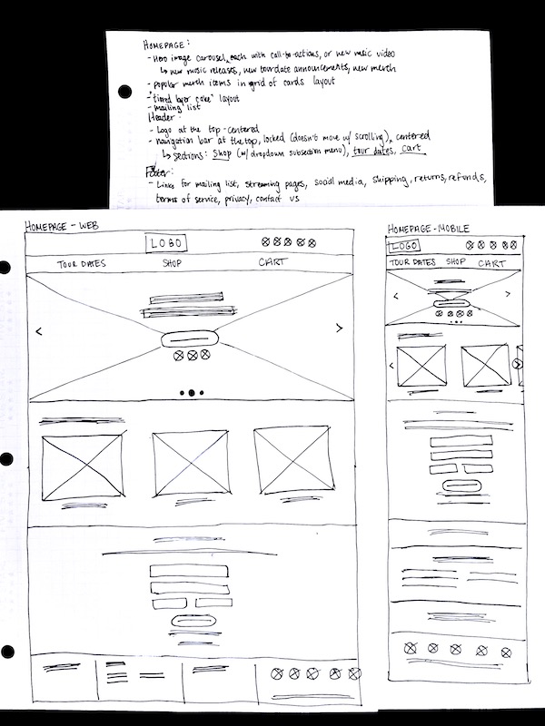
I started with sketched wireframes using the “crazy eights” method to quickly iterate through ideas and chose the best elements to include in refined paper wireframes. Below are iterations for the home screen and individual album vinyl screen.

Crazy 8s exercise for home page and purchase flow pagesHome page paper wireframesProduct page paper wireframe

Digital WIREFRAMES & PROTOTYPING

A major user pain point discovered in the interviews was that users often have issues viewing merch stores on mobile devices. With this in mind, I created designs for additional screen sizes to ensure a responsive mobile site. Below are the digital wireframes for the homepage and individual album vinyl page created on Adobe XD for desktop and mobile.

Home page lofi web mockupHome page lofi mobile mockupVinyl page lofi web mockupVinyl page lofi mobile mockup

USABILITY TESTING & HI-FI ITERATIONS

I conducted a moderated usability study with 4 participants. A moderated study was chosen to create a comfortable environment for participants to understand the testing process and encourage vocalizing their thought processes. The data from the study was synthesized into patterns and insights using an affinity diagram. I found 3 key insights.

Reading pattern wasn’t intuitive.
On several checkout screens, users were taking a long time to find the “continue to” buttons. The location didn't match natural eye flow & reading patterns. I adjusted the button location according to participant expectations & placed it at the bottom of the order summary.Reading pattern wasn’t intuitive.
On several checkout screens, users were taking a long time to find the “continue to” buttons. The location didn't match natural eye flow & reading patterns. I adjusted the button location according to participant expectations & placed it at the bottom of the order summary.Several elements were too large.
Many elements & text took up too much space and were distracting from the main task. I made sizing adjustments & added white space to allow for more focus on the most important elements of each screen.Several elements were too large.
Many elements & text took up too much space and were distracting from the main task. I made sizing adjustments & added white space to allow for more focus on the most important elements of each screen.Hero image links weren't popping out enough.
The home page hero buttons were too small, especially on mobile site, & users were passing over it. I fixed this by expanding & spreading out the buttons.Hero image links weren't popping out enough.
The home page hero buttons were too small, especially on mobile site, & users were passing over it. I fixed this by expanding & spreading out the buttons.

final designs

After the usability study, I worked on the hi-fi designs for a few weeks & developed the final hi-fi prototype.

Home page hifi web mockup

Home page, hero section

Music collections page hifi web mockup

Music Collection page, organized by album era

Home page hifi mobile mockup

Home page, hero section

Music collection page hifi mobile mockup

Music Collections page, organized by album era

Vinyl page hifi mobile mockup

Individual Product page, with related streaming links

Cart page hifi mobile mockup

Cart page

Purchase confirmation page hifi mobile mockup

Purchase Confirmation Page

ACcessibility

The following considerations were taken to increase accessibility:

1

Utilized clear visual hierarchy cues through heading sizes

2

Organized pages by recognizable landmarks to aid assistive technologies

3

Tested with color contrast tools to ensure readability under colorblind visibilities

Design System

All visual elements are cohesive with the existing Phoebe Bridgers visual identity. A darker color scheme, olden-style typography choices, and skeleton imagery/icons contribute to the “haunted” themes referenced in her art, allowing fans to feel immersed in the world of Phoebe Bridgers.

design system for web

What did i learn?

  1. Adobe XD. This was my first time working in Adobe XD, and it was pretty intuitive to use (I have experience with other Adobe tools and Figma).
  2. The process works! The user-centered design framework breaks down everything into small, actionable steps. It sets up for the overall strategic mindset and parameters needed for the creative designing to flow easily, while accounting for the cycle of iterative improvement.
  3. Keep early designs simple. As a creative, it was instinctual to get excited by the design process and build out all of the elements in the initial digital wireframes. However, I learned that it’s a better use of my time to determine what works and what doesn’t through early testing and critique feedback. I learned to not get attached to designs because testing often leads to needed changes.
  4. Great feedback can come from anyone. Formal usability testing can get you great feedback from target users, but it’s also very helpful and convenient to ask whoever's around to take a quick look at your work. Everyone has a unique perspective, and you can get very insightful comments in a matter of seconds!

Peer reviews

Throughout the design process, I shared my project with fellow designers from around the world for feedback. Here’s some of what they had to say!

Mateusz Skorodzień said "Amazing work! keep it up :)"Sara Shekarchi said "well done"Jeongwon Choi said "Nice work."Hamza Sadouk said "good job"Natalia said "great work"Bharath gowda B J said "Same as others, you've done it well and are easy to understand. great job!"Cooper Bailey said "fantastic! love the character in the website"

Scroll to